Edip Emre Bodur
a4dac59643
Fixes for unreachable project issues when transfer repository from organization ( #31770 )
...
When transferring repositories that have issues linked to a project
board to another organization, the issues remain associated with the
original project board. This causes the columns in the project board to
become bugged, making it difficult to move other issues in or out of the
affected columns. As a solution, I removed the issue relations since the
other organization does not have this project table.

Fix for #31538

Co-authored-by: Jason Song <i@wolfogre.com>
2024-08-13 02:53:43 +00:00
Zettat123
8883d99184
Support issue template assignees ( #31083 )
...
Resolve #13955
2024-08-12 16:00:40 +08:00
Jason Song
0470646d46
Show lock owner instead of repo owner on LFS setting page ( #31788 )
...
Fix #31784 .
Before:
<img width="1648" alt="image"
src="https://github.com/user-attachments/assets/03f32545-4a85-42ed-bafc-2b193a5d8023 ">
After:
<img width="1653" alt="image"
src="https://github.com/user-attachments/assets/e5bcaf93-49cb-421f-aac1-5122bc488b02 ">
2024-08-11 14:48:20 +00:00
Fábio Barkoski
e45a4c9829
Move repository visibility to danger zone in the settings area ( #31126 )
...
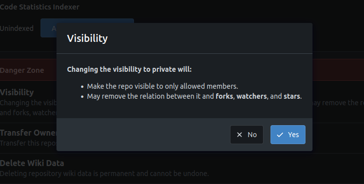
Moved repository visibility to the danger zone in the settings area. To
change the visibility, it is necessary to go to the danger zone, click
on the private/public button, and accept the change in the modal.
Resolves: #23826
---
## Screenshots
<details>
<summary>Before</summary>
Private repo:

Public repo:

</details>
<details>
<summary>After</summary>
Make private:

Make private modal

Make public:
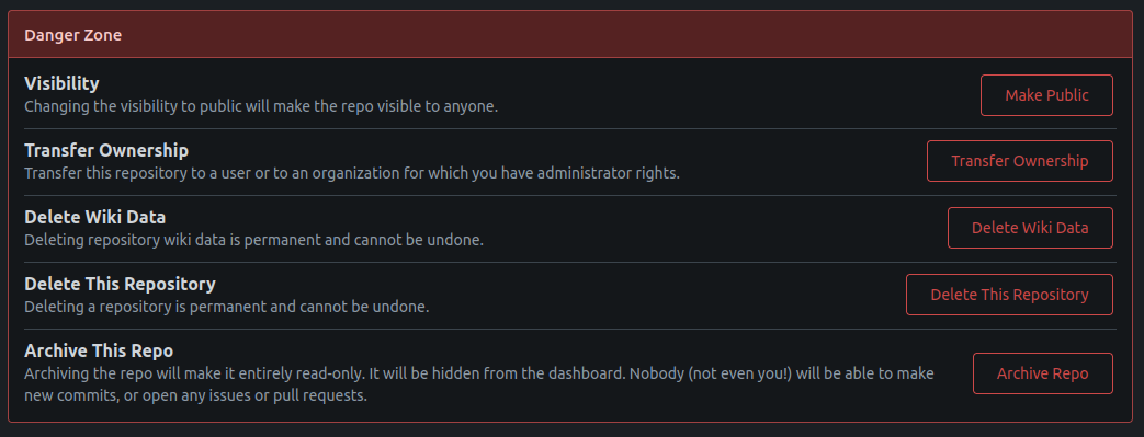
Make public modal

</details>
---------
Co-authored-by: Kemal Zebari <60799661+kemzeb@users.noreply.github.com>
2024-08-11 07:50:54 +03:00
a1012112796
9633f336c8
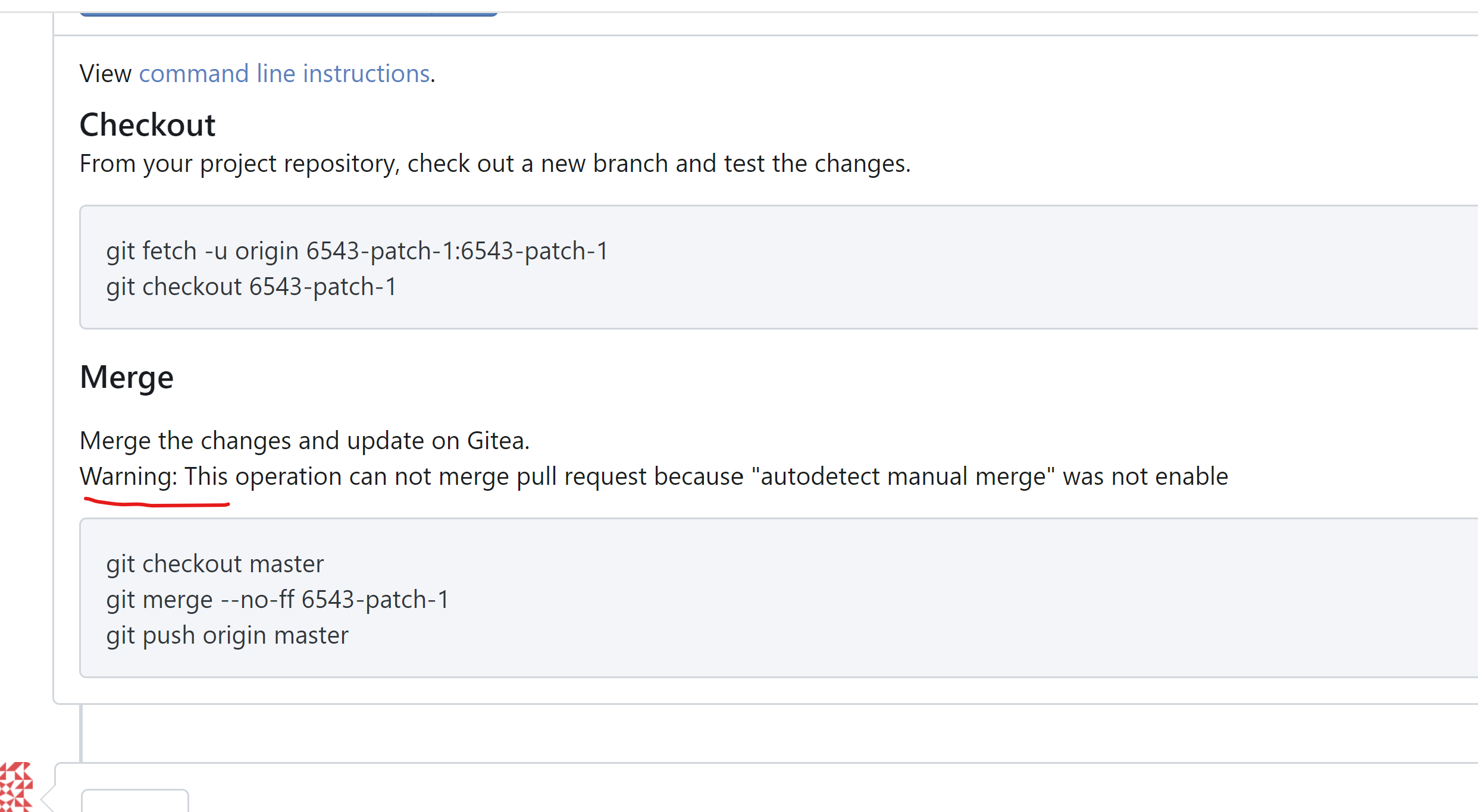
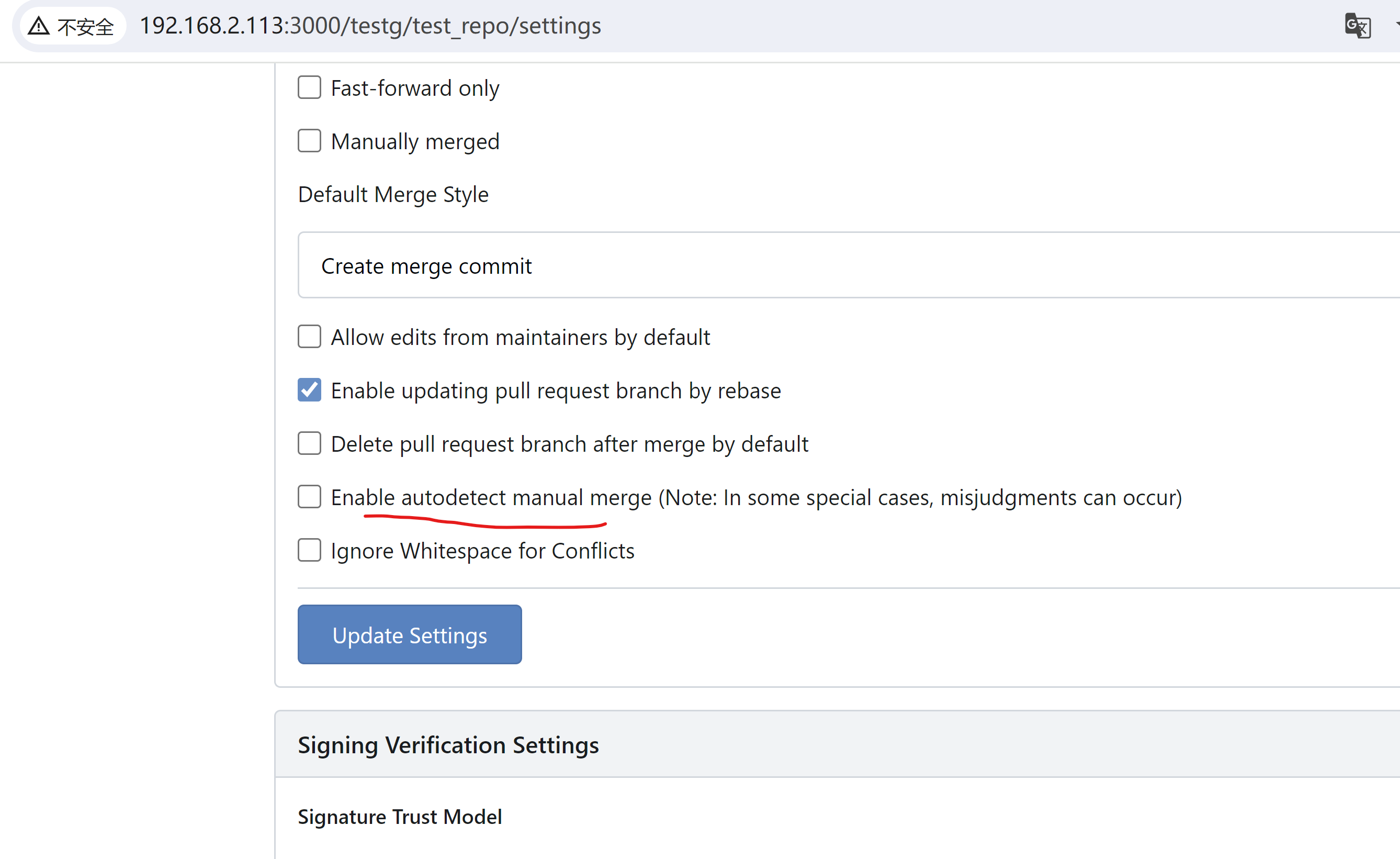
Add warning message in merge instructions when AutodetectManualMerge was not enabled ( #31805 )
...
not enabled
quick-f-i-x https://github.com/go-gitea/gitea/issues/31433 ? , maybe
need more disscusion about better solutions.
example view:
adtion notes about how to enable `AutodetectManualMerge`
Signed-off-by: a1012112796 <1012112796@qq.com>
2024-08-10 01:09:34 +00:00
Lunny Xiao
791d7fc76a
Add issue comment when moving issues from one column to another of the project ( #29311 )
...
Fix #27278
Replace #27816
This PR adds a meta-comment for an issue when dragging an issue from one
column to another of a project.
<img width="600" alt="image"
src="https://github.com/go-gitea/gitea/assets/81045/5fc1d954-430e-4db0-aaee-a00006fa91f5 ">
---------
Co-authored-by: wxiaoguang <wxiaoguang@gmail.com>
Co-authored-by: yp05327 <576951401@qq.com>
2024-08-09 01:29:02 +00:00
yp05327
75d0b61546
Fix the display of project type for deleted projects ( #31732 )
...
Fix : #31727
After:

2024-07-30 04:37:43 +00:00
Bartlomiej Komendarczuk
e8d4b7a8b1
Added default sorting milestones by name ( #27084 )
...
#26996
Added default sorting for milestones by name.
Additional, name for sorting closestduedate and furthestduedate was
broken, so I fixed it.

---------

Co-authored-by: Lunny Xiao <xiaolunwen@gmail.com>
2024-07-16 10:08:54 +02:00
silverwind
0bb4c1cde2
Code editor theme enhancements ( #31629 )
...
1. Fixed border-radius
2. Monaco ignores the alpha channel on the shadow color, introduce
`color-shadow-opaque`
3. Remove scrollbar color which follows
https://github.com/go-gitea/gitea/pull/29800
Before:
<img width="34" alt="Screenshot 2024-07-13 at 15 38 18"
src="https://github.com/user-attachments/assets/042d9bde-6db9-4467-a2a4-8f61ecc773eb ">
<img width="35" alt="Screenshot 2024-07-13 at 15 38 31"
src="https://github.com/user-attachments/assets/04146ee0-551c-4ff2-9636-bd119b33595a ">
After:
<img width="45" alt="Screenshot 2024-07-13 at 15 38 06"
src="https://github.com/user-attachments/assets/1f58fa5a-1289-4e45-83c9-18ca82a5e266 ">
<img width="39" alt="Screenshot 2024-07-13 at 21 16 56"
src="https://github.com/user-attachments/assets/e12ebe22-b29b-4798-9f0d-4c100f311562 ">
2024-07-14 23:22:48 +00:00
6543
d7c7a78994
Don't show hidden labels when filling out an issue template ( #31576 )
...
Related to #31574


---
*Sponsored by Kithara Software GmbH*
2024-07-08 04:31:12 +00:00
Henry Goodman
12cb1d2998
Allow force push to protected branches ( #28086 )
...
Fixes #22722
### Problem
Currently, it is not possible to force push to a branch with branch
protection rules in place. There are often times where this is necessary
(CI workflows/administrative tasks etc).
The current workaround is to rename/remove the branch protection,
perform the force push, and then reinstate the protections.
### Solution
Provide an additional section in the branch protection rules to allow
users to specify which users with push access can also force push to the
branch. The default value of the rule will be set to `Disabled`, and the
UI is intuitive and very similar to the `Push` section.
It is worth noting in this implementation that allowing force push does
not override regular push access, and both will need to be enabled for a
user to force push.
This applies to manual force push to a remote, and also in Gitea UI
updating a PR by rebase (which requires force push)
This modifies the `BranchProtection` API structs to add:
- `enable_force_push bool`
- `enable_force_push_whitelist bool`
- `force_push_whitelist_usernames string[]`
- `force_push_whitelist_teams string[]`
- `force_push_whitelist_deploy_keys bool`
### Updated Branch Protection UI:
<img width="943" alt="image"
src="https://github.com/go-gitea/gitea/assets/79623665/7491899c-d816-45d5-be84-8512abd156bf ">
### Pull Request `Update branch by Rebase` option enabled with source
branch `test` being a protected branch:

<img width="1038" alt="image"
src="https://github.com/go-gitea/gitea/assets/79623665/57ead13e-9006-459f-b83c-7079e6f4c654 ">
---------
Co-authored-by: wxiaoguang <wxiaoguang@gmail.com>
2024-07-05 18:21:56 +00:00
silverwind
e82f3caa6b
Always use HTML attributes for avatar size ( #31509 )
...
Many avatars were rendered in HTML with certain width/height but then
resized again in CSS. This was pointless so I removed all these cases
and made the HTML size match the previous render size.
Also did a few CSS cleanups in the tribute rendering:
<img width="648" alt="image"
src="https://github.com/go-gitea/gitea/assets/115237/cb2fafb3-5e20-46e9-814f-07df20038beb ">
2024-06-28 21:29:15 +00:00
CyberFlame
72c66bd479
use correct l10n string ( #31487 )
...
Uses the correct string for searching - this is what it looks like prior
to the change:
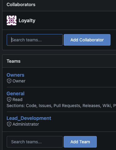
(observe how the top box has "Search teams" even though collaborator
would be user
2024-06-25 14:54:18 +00:00
Kemal Zebari
0c4ff01109
Disable issue/PR comment button given empty input ( #31463 )
...
Given an empty issue/PR comment, the comment history would not be
updated if the user were to submit it. Therefore, it would make since to
just disable the comment button when the text editor is empty.

This is inline with what GitHub does when given empty text editor input.

---------

Co-authored-by: wxiaoguang <wxiaoguang@gmail.com>
2024-06-23 18:41:01 +00:00
wxiaoguang
1a811c0bd1
Refactor image diff ( #31444 )
...
And remove some jQuery functions
2024-06-22 04:52:09 +00:00
wxiaoguang
ed5ded3ff8
Fix the link for .git-blame-ignore-revs bypass ( #31432 )
...
A quick fix for #31429
2024-06-20 23:28:34 +00:00
charles
c60ef946b1
Fix the wrong line number in the diff view page when expanded twice. ( #31431 )
...
close #31149 , regression of #29385 (incorrect `data-query=`)
2024-06-20 17:43:42 +00:00
wxiaoguang
37a4b233a0
Refactor repo unit "disabled" check ( #31389 )
...
1. There are already global "unit consts", no need to use context data, which is fragile
2. Remove the "String()" method from "unit", it would only cause rendering problems in templates

---------

Co-authored-by: silverwind <me@silverwind.io>
2024-06-18 00:51:13 +00:00
wxiaoguang
47ca61d8ba
Improve detecting empty files ( #31332 )
...
Co-authored-by: silverwind <me@silverwind.io>
2024-06-13 01:06:46 +00:00
silverwind
21ba5ca03b
Fix navbar + menu flashing on page load ( #31281 )
...
Fixes
https://github.com/go-gitea/gitea/pull/31273#issuecomment-2153771331 .
Same method as used in https://github.com/go-gitea/gitea/pull/30215 . All
left-opening dropdowns need to use it method.
---------
Co-authored-by: wxiaoguang <wxiaoguang@gmail.com>
Co-authored-by: Giteabot <teabot@gitea.io>
2024-06-12 14:58:03 +00:00
Kerwin Bryant
e6ab6e637f
code optimization ( #31315 )
...
Simplifying complex if-else to existing Iif operations
2024-06-11 21:07:10 +08:00
silverwind
a2304cb163
Remove jQuery .text() ( #30506 )
...
Remove and forbid [.text()](https://api.jquery.com/text/ ). Tested some,
but not all functionality, but I think these are pretty safe
replacements.
---------
Co-authored-by: wxiaoguang <wxiaoguang@gmail.com>
2024-06-10 18:12:31 +08:00
Max Wipfli
da4bbc4247
Allow including Reviewed-on/Reviewed-by lines for custom merge messages ( #31211 )
...
This PR introduces the `ReviewedOn` and `ReviewedBy` variables for the
default merge message templates (e.g.,
`.gitea/default_merge_message/MERGE_TEMPLATE.md`).
This allows customizing the default merge messages while retaining these
trailers.
This also moves the associated logic out of `pull.tmpl` into the
relevant Go function.
This is a first contribution towards #11077 .
---
For illustration, this allows to recreate the "default default" merge
message with the following template:
```
.gitea/default_merge_message/MERGE_TEMPLATE.md
Merge pull request '${PullRequestTitle}' (${PullRequestReference}) from ${HeadBranch} into ${BaseBranch}
${ReviewedOn}
${ReviewedBy}
```
2024-06-06 08:35:04 +00:00
wxiaoguang
e728fd741b
Fix Activity Page Contributors dropdown ( #31264 )
...
Fix #31261
2024-06-06 10:28:33 +08:00
silverwind
138e946c3d
Replace gt-word-break with tw-break-anywhere ( #31183 )
...
`overflow-wrap: anywhere` is a superior alternative to `word-wrap:
break-word` and we were already setting it in the class. I tested a few
cases, all look good.
2024-06-04 13:57:11 +00:00
silverwind
1f8ac27b31
Fix overflow on push notification ( #31179 )
...
Fixes: https://github.com/go-gitea/gitea/issues/30063
<img width="1301" alt="Screenshot 2024-05-30 at 14 43 24"
src="https://github.com/go-gitea/gitea/assets/115237/00443af0-088d-49a5-be9e-8c9adcc2c01d ">
2024-06-04 07:14:24 +00:00
silverwind
9b05bfb173
Fix overflow in issue card ( #31203 )
...
Before:
<img width="373" alt="Screenshot 2024-06-01 at 01 31 26"
src="https://github.com/go-gitea/gitea/assets/115237/82a210f2-c82e-4b7e-ac43-e70e46fa1186 ">
After:
<img width="376" alt="Screenshot 2024-06-01 at 01 31 32"
src="https://github.com/go-gitea/gitea/assets/115237/82d1b9f7-4fad-47bd-948a-04e1e7e006e6 ">
2024-06-03 00:09:51 +00:00
Lunny Xiao
2788a7ca27
Fix agit checkout command line hint & fix ShowMergeInstructions checking ( #31219 )
2024-06-03 06:45:21 +08:00
silverwind
7034efc7dc
Use vertical layout for multiple code expander buttons ( #31122 )
...
Fixes: https://github.com/go-gitea/gitea/issues/31068
- Now it only does a single call to `GetExpandDirection` per line
instead of multiples.
- Exposed `data-expand-direction` to frontend so it can correctly size
the buttons (it's a pain to do in tables).
<img width="142" alt="Screenshot 2024-05-27 at 20 44 56"
src="https://github.com/go-gitea/gitea/assets/115237/8b0b45a6-8e50-4081-8822-5e0775d8d941 ">
<img width="142" alt="Screenshot 2024-05-27 at 20 44 51"
src="https://github.com/go-gitea/gitea/assets/115237/b7ba2c57-8f55-4e9f-9606-c96d16b77892 ">
<img width="132" alt="Screenshot 2024-05-27 at 20 44 46"
src="https://github.com/go-gitea/gitea/assets/115237/0e838fb8-5e8c-4250-9843-a68b88d5418b ">
<img width="80" alt="Screenshot 2024-05-27 at 20 44 33"
src="https://github.com/go-gitea/gitea/assets/115237/da6c7f83-c160-4389-8ab2-889d0568cbe8 ">
<img width="80" alt="Screenshot 2024-05-27 at 20 44 26"
src="https://github.com/go-gitea/gitea/assets/115237/cdb490b2-5040-484a-92e5-46fc5e37c199 ">
<img width="78" alt="Screenshot 2024-05-27 at 20 44 20"
src="https://github.com/go-gitea/gitea/assets/115237/d2978ab0-764e-41ff-922c-25f8fe749f28 ">
Would backport as trivial enhancement.
2024-05-29 06:08:45 +00:00
silverwind
1e3c4d8fc7
Improve mobile review ui ( #31091 )
...
Fixes: https://github.com/go-gitea/gitea/issues/31071
Not perfect but much better than before.
Before: Overflows, sticky not working, filename unreadable:
<img width="506" alt="Screenshot 2024-05-27 at 02 02 40"
src="https://github.com/go-gitea/gitea/assets/115237/a06b1edf-dece-4402-98c2-68670fca265f ">
After:
<img width="457" alt="Screenshot 2024-05-27 at 01 59 06"
src="https://github.com/go-gitea/gitea/assets/115237/2a282c96-e719-4554-b418-81963ae6269c ">
2024-05-28 13:41:37 +00:00
metiftikci
aa92b13164
Prevent simultaneous editing of comments and issues ( #31053 )
...
fixes #22907
Tested:
- [x] issue content edit
- [x] issue content change tasklist
- [x] pull request content edit
- [x] pull request change tasklist

2024-05-27 15:34:18 +00:00
Lunny Xiao
98751108b1
Rename project board -> column to make the UI less confusing ( #30170 )
...
This PR split the `Board` into two parts. One is the struct has been
renamed to `Column` and the second we have a `Template Type`.

But to make it easier to review, this PR will not change the database
schemas, they are just renames. The database schema changes could be in
future PRs.

---------

Co-authored-by: silverwind <me@silverwind.io>
Co-authored-by: yp05327 <576951401@qq.com>
2024-05-27 08:59:54 +00:00
delvh
072b029b33
Simplify review UI ( #31062 )
...
Instead of always displaying all available actions as buttons, merge
them into a single dropdown menu, same as GitHub. That decreases visual
overload and is more mobile-friendly, while not losing any
functionality.
## Screenshots
<details><summary>Before</summary>

</details>
<details><summary>After (unexpanded)</summary>

</details>
<details><summary>After (expanded)</summary>

</details>
2024-05-27 08:24:34 +00:00
silverwind
6e140b58dd
Prevent tab shifting, remove extra margin on fluid pages ( #31090 )
...
1. Extend concept of https://github.com/go-gitea/gitea/pull/29831 to all
tabular menus, there were only three left that weren't already
`<overflow-menu>`.
<img width="634" alt="Screenshot 2024-05-27 at 00 42 16"
src="https://github.com/go-gitea/gitea/assets/115237/d9a7e219-d05e-40a1-9e93-777f9a8a90dd ">
<img width="965" alt="Screenshot 2024-05-27 at 00 29 32"
src="https://github.com/go-gitea/gitea/assets/115237/e6ed71b1-11fb-4a74-9adb-af4524286cff ">
2. Remove extra padding on `fluid padded` container like for example PR
diff view. The page margin is already correctly sized via
`.ui.container`, so this was just extraneous padding that looked ugly.
Before:
<img width="1351" alt="Screenshot 2024-05-27 at 00 45 11"
src="https://github.com/go-gitea/gitea/assets/115237/4b45fd11-b1b2-4fbb-a618-26eb22be9472 ">
After:
<img width="1344" alt="Screenshot 2024-05-27 at 00 45 22"
src="https://github.com/go-gitea/gitea/assets/115237/d09593eb-6c7f-45e7-85b6-f0050047004b ">
3. Replace `gt-word-break` with `tw-break-anywhere` in issue-title,
fixing overflow.
Before:
<img width="1333" alt="Screenshot 2024-05-27 at 00 50 14"
src="https://github.com/go-gitea/gitea/assets/115237/64d15d04-b456-401e-a972-df636965f0eb ">
After:
<img width="1316" alt="Screenshot 2024-05-27 at 00 50 26"
src="https://github.com/go-gitea/gitea/assets/115237/ed1ce830-1408-414b-8263-eeaf773f52c8 ">
2024-05-27 06:45:16 +00:00
Zettat123
7ab0988af1
Support setting the default attribute of the issue template dropdown field ( #31045 )
...
Fix #31044
According to [GitHub issue template
documentation](https://docs.github.com/en/communities/using-templates-to-encourage-useful-issues-and-pull-requests/syntax-for-githubs-form-schema#attributes-for-dropdown ),
the `default` attribute can be used to specify the preselected option
for a dropdown field.
2024-05-23 13:01:02 +00:00
yp05327
daf2a4c047
Fix wrong display of recently pushed notification ( #25812 )
...
There's a bug in #25715 :
If user pushed a commit into another repo with same branch name, the
no-related repo will display the recently pushed notification
incorrectly.
It is simple to fix this, we should match the repo id in the sql query.
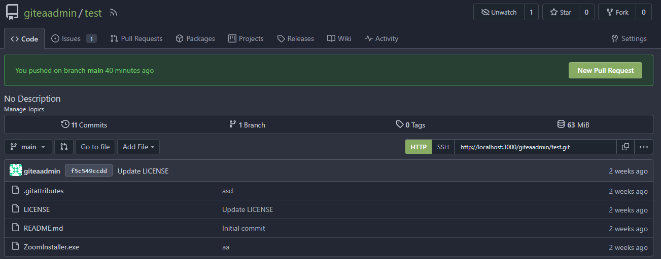
The latest commit is 2 weeks ago.

The notification comes from another repo with same branch name:

After:
In forked repo:

New PR Link will redirect to the original repo:

In the original repo:

New PR Link:

In the same repo:

New PR Link:

08/15 Update:
Follow #26257 , added permission check and logic fix mentioned in
https://github.com/go-gitea/gitea/pull/26257#discussion_r1294085203
2024/04/25 Update:
Fix #30611
---------
Co-authored-by: silverwind <me@silverwind.io>
Co-authored-by: Lunny Xiao <xiaolunwen@gmail.com>
Co-authored-by: wxiaoguang <wxiaoguang@gmail.com>
2024-05-21 17:00:35 +00:00
Kemal Zebari
1007ce764e
Don't include link of deleted branch when listing branches ( #31028 )
...
From
https://github.com/go-gitea/gitea/issues/31018#issuecomment-2119622680 .
This commit removes the link to a deleted branch name because it returns
a 404 while it is in this deleted state. GitHub also throws a 404 when
navigating to a branch link that was just deleted, but this deleted
branch is removed from the branch list after a page refresh. Since with
Gitea this deleted branch would be kept around for quite some time
(well, until the "cleanup deleted branches" cron job begins), it makes
sense to not have this as a link that users can navigate to.
2024-05-21 02:23:07 +00:00
wxiaoguang
f48cc501c4
Fix incorrect "blob excerpt" link when comparing files ( #31013 )
...
When comparing files between the base repo and forked repo, the "blob
excerpt" link should point to the forked repo, because the commit
doesn't exist in base repo.

Co-authored-by: Giteabot <teabot@gitea.io>
2024-05-20 05:57:57 +00:00
wxiaoguang
edbf74c418
Fix "force private" logic ( #31012 )
...
When creating a repo, the "FORCE_PRIVATE" config option should be
respected, `readonly` doesn't work for checkbox, so it should use
`disabled` attribute.
2024-05-20 00:56:45 +00:00
wxiaoguang
740b6e1389
Fix JS error when editing a merged PR's title ( #30990 )
2024-05-16 13:04:25 +00:00
Frank Villaro-Dixon
2611249511
template: label fix correct input id ( #30987 )
...
Signed-off-by: Frank Villaro-Dixon <frank@villaro-dixon.eu>
2024-05-16 14:36:31 +08:00
silverwind
ea8e4baacc
Put web editor into a segment ( #30966 )
...
Implement
https://github.com/go-gitea/gitea/pull/30707#issuecomment-2084126206

Diff without whitespace:
https://github.com/go-gitea/gitea/pull/30966/files?diff=unified&w=1

Might as well backport.
2024-05-15 14:54:34 +00:00
silverwind
ed25676a9a
Restyle release list, fix branch dropdown ( #30837 )
...
Fixes https://github.com/go-gitea/gitea/issues/30821 and restyles the
release list.
Desktop:
<img width="1199" alt="Screenshot 2024-05-02 at 20 46 10"
src="https://github.com/go-gitea/gitea/assets/115237/bee92423-d4a9-4b26-8301-3a1e09eef4cd ">
Mobile:
<img width="443" alt="Screenshot 2024-05-02 at 20 46 21"
src="https://github.com/go-gitea/gitea/assets/115237/42ecbae5-bdb6-4b16-a0ee-9c64daede68d ">
---------
Co-authored-by: Giteabot <teabot@gitea.io>
2024-05-13 23:33:51 +02:00
silverwind
301eaf60bf
Fix file path width in repo non-homepage view ( #30951 )
...
Fixes: https://github.com/go-gitea/gitea/issues/30940
<img width="1310" alt="Screenshot 2024-05-11 at 20 48 41"
src="https://github.com/go-gitea/gitea/assets/115237/f163dfd4-1299-421f-a99e-cd0c793e0e3d ">
2024-05-12 04:02:25 +00:00
wxiaoguang
080486e47d
Fix some UI regressions for commit list ( #30920 )
...
Close #30919

---------

Co-authored-by: silverwind <me@silverwind.io>
2024-05-10 12:58:05 +00:00
wxiaoguang
3fdb2d4ad8
Fix incorrect issue form ( #30881 )
...
Fix #30864
2024-05-08 15:39:13 +00:00
wxiaoguang
eda10cc2bb
Fix some UI problems (dropdown/container) ( #30849 )
...
Follow #30345
Follow #30547

`ellipsis` / `white-space` shouldn't be put on the general dropdown components.
2024-05-06 07:17:22 +00:00
wxiaoguang
5c236bd4c0
Fix issue/PR title edit ( #30858 )
...
1. "enter" doesn't work (I think it is the last enter support for #14843 )
2. if a branch name contains something like `&`, then the branch selector doesn't update
2024-05-05 13:09:41 +00:00
silverwind
c445a85528
Improve repo button row layout ( #30668 )
...
Since there is now a second `<input>` in the repo buttons, we can make a
better-looking layout with no empty space, except on mobile.
Also I fixed one bug with focus border on clone panel.
## Large
<img width="1163" alt="Screenshot 2024-04-23 at 22 25 22"
src="https://github.com/go-gitea/gitea/assets/115237/8135a572-aa67-4672-ad49-b76b06890b52 ">
## Medium
<img width="870" alt="Screenshot 2024-04-23 at 22 25 34"
src="https://github.com/go-gitea/gitea/assets/115237/9e93f61c-3315-4a78-8328-8cefad5b50fa ">
## Mobile
<img width="416" alt="Screenshot 2024-04-23 at 22 25 52"
src="https://github.com/go-gitea/gitea/assets/115237/859e341f-807a-48e6-8bcf-31715963216c ">
2024-05-02 19:10:49 +00:00
wxiaoguang
6ff2acc52c
Fix issue card layout ( #30800 )
...
Fix #30788
2024-05-02 11:19:44 +00:00