mirror of
https://github.com/go-gitea/gitea
synced 2025-02-19 09:17:03 +01:00
 b9baed2c74
This PR introduces a new UI element type for Gitea called `flex-item`. It consists of a horizontal card with a leading, main and trailing part:  The idea behind it is that in Gitea UI, we have many cases where we use this kind of layout, but it is achieved in many different ways: - grid layout - `.ui.list` with additional hacky flexbox - `.ui.key.list` - looks to me like a style set originally created for ssh/gpg key list, was used in many other places - `.issue.list` - created for issue cards, used in many other places - ... This new style is based on `.issue.list`, specifically the refactoring of it done in #25750. In this PR, the new element is introduced and lots of templates are being refactored to use that style. This allows to remove a lot of page-specific css, makes many of the elements responsive or simply provides a cleaner/better-looking way to present information. A devtest section with the new style is also available. <details> <summary>Screenshots (left: before, right: after)</summary> 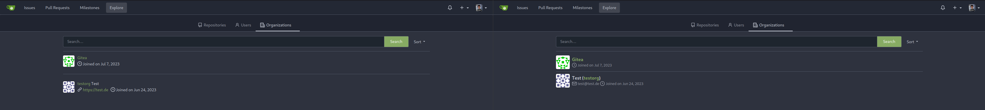  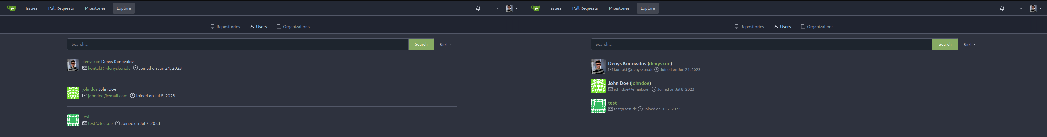  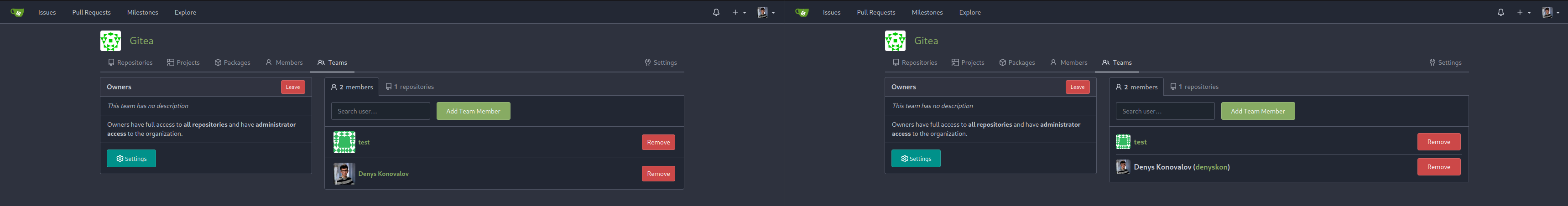          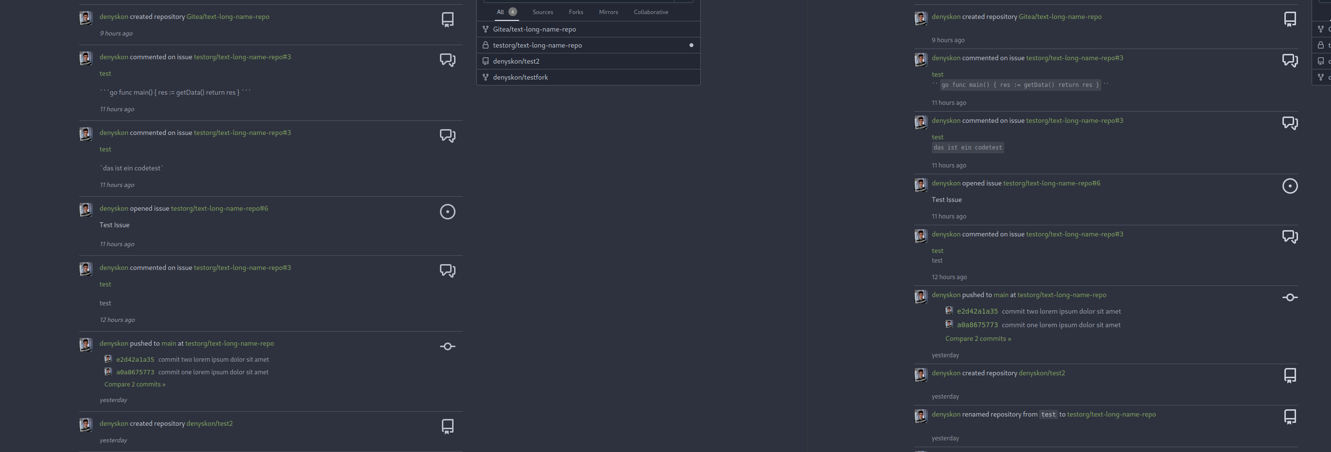  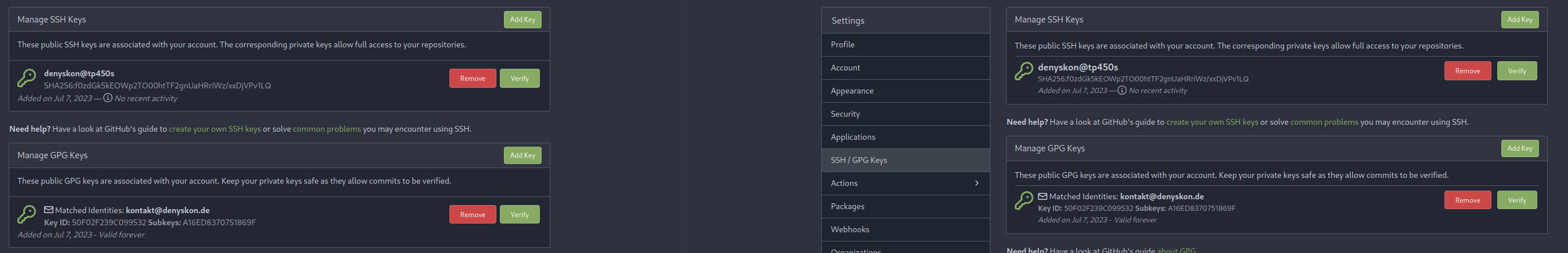  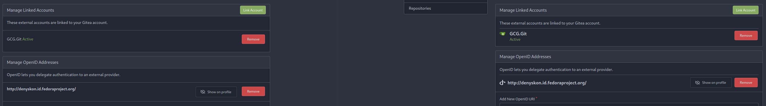 </details> --------- Co-authored-by: Giteabot <teabot@gitea.io>
316 lines
11 KiB
Handlebars
316 lines
11 KiB
Handlebars
{{template "base/head" .}}
|
|
<link rel="stylesheet" href="{{AssetUrlPrefix}}/css/devtest.css?v={{AssetVersion}}">
|
|
<div class="page-content devtest ui container">
|
|
<div>
|
|
<h1>Button</h1>
|
|
<div>
|
|
Style:
|
|
<label><input type="checkbox" name="button-style-compact" value="compact">compact</label>
|
|
<label><input type="radio" name="button-style-size" value="">(normal)</label>
|
|
<label><input type="radio" name="button-style-size" value="tiny">tiny</label>
|
|
<label><input type="radio" name="button-style-size" value="mini">mini</label>
|
|
</div>
|
|
<div>
|
|
State:
|
|
<label><input type="checkbox" name="button-state-disabled" value="disabled">disabled</label>
|
|
</div>
|
|
<div id="devtest-button-samples">
|
|
<ul class="button-sample-groups">
|
|
<li class="sample-group">
|
|
<h2>General purpose:</h2>
|
|
<button class="ui button">Unclassed</button>
|
|
<button class="ui basic button">Basic Unclassed</button>
|
|
<button class="ui primary button">Primary</button>
|
|
<button class="ui basic primary button">Basic Primary</button>
|
|
<button class="ui negative button">Negative</button>
|
|
<button class="ui basic negative button">Basic Negative</button>
|
|
<button class="ui positive button">Positive</button>
|
|
<button class="ui basic positive button">Basic Positive</button>
|
|
</li>
|
|
<li class="sample-group">
|
|
<h2>Recommended colors:</h2>
|
|
<button class="ui red button">Red</button>
|
|
<button class="ui basic red button">Basic Red</button>
|
|
<button class="ui green button">Green</button>
|
|
<button class="ui basic green button">Basic Green</button>
|
|
<button class="ui blue button">Blue</button>
|
|
<button class="ui basic blue button">Basic Blue</button>
|
|
<button class="ui orange button">Orange</button>
|
|
<button class="ui basic orange button">Basic Orange</button>
|
|
<button class="ui yellow button">Yellow</button>
|
|
<button class="ui basic yellow button">Basic Yellow</button>
|
|
</li>
|
|
<li class="sample-group">
|
|
<h2>Supported but not recommended:</h2>
|
|
<p>Do not use if there is no strong requirement. Do not use grey/black buttons, they don't work well with dark theme.</p>
|
|
<button class="ui secondary button">Secondary</button>
|
|
<button class="ui basic secondary button">Basic Secondary</button>
|
|
<button class="ui olive button">Olive</button>
|
|
<button class="ui basic olive button">Basic Olive</button>
|
|
<button class="ui teal button">Teal</button>
|
|
<button class="ui basic teal button">Basic Teal</button>
|
|
<button class="ui violet button">Violet</button>
|
|
<button class="ui basic violet button">Basic Violet</button>
|
|
<button class="ui purple button">Purple</button>
|
|
<button class="ui basic purple button">Basic Purple</button>
|
|
<button class="ui pink button">Pink</button>
|
|
<button class="ui basic pink button">Basic Pink</button>
|
|
<button class="ui brown button">Brown</button>
|
|
<button class="ui basic brown button">Basic Brown</button>
|
|
</li>
|
|
<li class="sample-group">
|
|
<h2>Inline / Plain:</h2>
|
|
<div class="gt-my-2">
|
|
<button class="btn gt-p-3">Plain button</button>
|
|
<button class="btn interact-fg gt-p-3">Plain button with interact fg</button>
|
|
<button class="btn interact-bg gt-p-3">Plain button with interact bg</button>
|
|
</div>
|
|
</li>
|
|
</ul>
|
|
<script type="module">
|
|
const $buttons = $('#devtest-button-samples').find('button.ui');
|
|
|
|
const $buttonStyles = $('input[name*="button-style"]');
|
|
$buttonStyles.on('click', () => $buttonStyles.map((_ ,el) => $buttons.toggleClass(el.value, el.checked)));
|
|
|
|
const $buttonStates = $('input[name*="button-state"]');
|
|
$buttonStates.on('click', () => $buttonStates.map((_ ,el) => $buttons.prop(el.value, el.checked)));
|
|
</script>
|
|
</div>
|
|
</div>
|
|
|
|
<div>
|
|
<h1>Tooltip</h1>
|
|
<div><span data-tooltip-content="test tooltip">text with tooltip</span></div>
|
|
<div><span data-tooltip-content="test tooltip" data-tooltip-interactive="true">text with interactive tooltip</span></div>
|
|
</div>
|
|
|
|
<div>
|
|
<h1>Loading</h1>
|
|
<div class="is-loading small-loading-icon gt-border-secondary gt-py-2"><span>loading ...</span></div>
|
|
<div class="is-loading gt-border-secondary gt-py-4">
|
|
<p>loading ...</p>
|
|
<p>loading ...</p>
|
|
<p>loading ...</p>
|
|
<p>loading ...</p>
|
|
</div>
|
|
</div>
|
|
|
|
<div>
|
|
<h1>GiteaOriginUrl</h1>
|
|
<div><gitea-origin-url data-url="test/url"></gitea-origin-url></div>
|
|
<div><gitea-origin-url data-url="/test/url"></gitea-origin-url></div>
|
|
</div>
|
|
|
|
<div>
|
|
<h1>LocaleNumber</h1>
|
|
<div>{{.locale.PrettyNumber 1}}</div>
|
|
<div>{{.locale.PrettyNumber 12}}</div>
|
|
<div>{{.locale.PrettyNumber 123}}</div>
|
|
<div>{{.locale.PrettyNumber 1234}}</div>
|
|
<div>{{.locale.PrettyNumber 12345}}</div>
|
|
<div>{{.locale.PrettyNumber 123456}}</div>
|
|
<div>{{.locale.PrettyNumber 1234567}}</div>
|
|
</div>
|
|
|
|
<div>
|
|
<h1>TimeSince</h1>
|
|
<div>Now: {{TimeSince .TimeNow $.locale}}</div>
|
|
<div>5s past: {{TimeSince .TimePast5s $.locale}}</div>
|
|
<div>5s future: {{TimeSince .TimeFuture5s $.locale}}</div>
|
|
<div>2m past: {{TimeSince .TimePast2m $.locale}}</div>
|
|
<div>2m future: {{TimeSince .TimeFuture2m $.locale}}</div>
|
|
<div>1y past: {{TimeSince .TimePast1y $.locale}}</div>
|
|
<div>1y future: {{TimeSince .TimeFuture1y $.locale}}</div>
|
|
</div>
|
|
|
|
<div>
|
|
<h1>SVG alignment</h1>
|
|
|
|
<h2>Text with SVG</h2>
|
|
<div class="flex-text-block">{{svg "octicon-alert"}} {{svg "octicon-x"}} text (block)</div>
|
|
<div><div class="flex-text-inline">{{svg "octicon-alert"}} {{svg "octicon-x"}} text</div> (inline)</div>
|
|
<div class="flex-items-block">
|
|
<div class="item">{{svg "octicon-alert"}} flex every line</div>
|
|
<div class="item">{{svg "octicon-alert"}} flex every item</div>
|
|
</div>
|
|
|
|
<h2>Button with SVG</h2>
|
|
<div>
|
|
<button class="ui red button">{{svg "octicon-alert" 24}} {{svg "octicon-x" 24}} text</button>
|
|
<div class="ui labeled button">
|
|
<button class="ui basic button">labeled button</button>
|
|
<a class="ui basic label">123</a>
|
|
</div>
|
|
</div>
|
|
|
|
<h2>Input with SVG</h2>
|
|
<div>
|
|
<div class="ui icon search input">
|
|
<i class="icon">{{svg "octicon-search"}}</i>
|
|
<input type="text" placeholder="place holder">
|
|
</div>
|
|
</div>
|
|
|
|
<h2>Dropdown with SVG</h2>
|
|
<div>
|
|
<div class="ui dropdown" style="border: 1px red dashed" data-tooltip-content="border for demo purpose only">
|
|
<span class="text">simple</span>
|
|
{{svg "octicon-triangle-down" 14 "dropdown icon"}}
|
|
<div class="menu">
|
|
<div class="item">item</div>
|
|
</div>
|
|
</div>
|
|
<div class="ui search selection dropdown">
|
|
<span class="text">search ...</span>
|
|
<input name="value" class="search">
|
|
{{svg "octicon-triangle-down" 14 "dropdown icon"}}
|
|
{{svg "octicon-x" 14 "remove icon"}}
|
|
<div class="menu">
|
|
<div class="item">item</div>
|
|
</div>
|
|
</div>
|
|
<div class="ui multiple selection dropdown">
|
|
<input class="hidden" value="1">
|
|
{{svg "octicon-triangle-down" 14 "dropdown icon"}}
|
|
{{svg "octicon-x" 14 "remove icon"}}
|
|
<div class="default text">empty multiple dropdown</div>
|
|
<div class="menu">
|
|
<div class="item">item</div>
|
|
</div>
|
|
</div>
|
|
<div class="ui multiple clearable search selection dropdown">
|
|
<input type="hidden" value="1">
|
|
{{svg "octicon-triangle-down" 14 "dropdown icon"}}
|
|
{{svg "octicon-x" 14 "remove icon"}}
|
|
<div class="default text">clearable search dropdown</div>
|
|
<div class="menu">
|
|
<div class="item" data-value="1">item</div>
|
|
</div>
|
|
</div>
|
|
<div class="ui buttons">
|
|
<button class="ui button">Button with Dropdown</button>
|
|
<div class="ui dropdown button icon">
|
|
{{svg "octicon-triangle-down"}}
|
|
<div class="menu">
|
|
<div class="item">item</div>
|
|
</div>
|
|
</div>
|
|
</div>
|
|
</div>
|
|
|
|
<div>
|
|
<div class="ui dropdown mini button">
|
|
<span class="text">mini dropdown</span>
|
|
{{svg "octicon-triangle-down" 14 "dropdown icon"}}
|
|
</div>
|
|
<div class="ui dropdown tiny button">
|
|
<span class="text">tiny dropdown</span>
|
|
{{svg "octicon-triangle-down" 14 "dropdown icon"}}
|
|
</div>
|
|
<div class="ui button dropdown">
|
|
<span class="text">button dropdown</span>
|
|
{{svg "octicon-triangle-down" 14 "dropdown icon"}}
|
|
</div>
|
|
<div class="ui dropdown large button">
|
|
<span class="text">large dropdown</span>
|
|
{{svg "octicon-triangle-down" 14 "dropdown icon"}}
|
|
</div>
|
|
</div>
|
|
|
|
<div>
|
|
<div class="ui dropdown mini compact button">
|
|
<span class="text">mini compact</span>
|
|
{{svg "octicon-triangle-down" 14 "dropdown icon"}}
|
|
</div>
|
|
<div class="ui dropdown tiny compact button">
|
|
<span class="text">tiny compact</span>
|
|
{{svg "octicon-triangle-down" 14 "dropdown icon"}}
|
|
</div>
|
|
<div class="ui button compact dropdown">
|
|
<span class="text">button compact</span>
|
|
{{svg "octicon-triangle-down" 14 "dropdown icon"}}
|
|
</div>
|
|
<div class="ui dropdown large compact button">
|
|
<span class="text">large compact</span>
|
|
{{svg "octicon-triangle-down" 14 "dropdown icon"}}
|
|
</div>
|
|
</div>
|
|
</div>
|
|
|
|
<div>
|
|
<h1>Toast</h1>
|
|
<div>
|
|
<button class="ui button" id="info-toast">Show Info Toast</button>
|
|
<button class="ui button" id="warning-toast">Show Warning Toast</button>
|
|
<button class="ui button" id="error-toast">Show Error Toast</button>
|
|
</div>
|
|
</div>
|
|
|
|
<div>
|
|
<h1>ComboMarkdownEditor</h1>
|
|
<div>ps: no JS code attached, so just a layout</div>
|
|
{{template "shared/combomarkdowneditor" .}}
|
|
</div>
|
|
<script src="{{AssetUrlPrefix}}/js/devtest.js?v={{AssetVersion}}"></script>
|
|
|
|
<div>
|
|
<h1>Flex List</h1>
|
|
<div class="flex-list">
|
|
<div class="flex-item">
|
|
<div class="flex-item-leading">
|
|
{{svg "octicon-info" 32}}
|
|
</div>
|
|
<div class="flex-item-main">
|
|
<div class="flex-item-title">
|
|
Flex Item
|
|
<span class="ui basic label">
|
|
with label
|
|
</span>
|
|
</div>
|
|
<div class="flex-item-body">
|
|
consists of leading/main/trailing part
|
|
</div>
|
|
<div class="flex-item-body">
|
|
main part contains title and (multiple) body lines
|
|
</div>
|
|
</div>
|
|
<div class="flex-item-trailing">
|
|
<button class="ui tiny red button">
|
|
{{svg "octicon-warning" 12}} Button
|
|
</button>
|
|
<button class="ui tiny green button">
|
|
{{svg "octicon-info" 12}} Button
|
|
</button>
|
|
</div>
|
|
</div>
|
|
<div class="flex-item">
|
|
<div class="flex-item-leading">
|
|
{{svg "octicon-repo" 32}}
|
|
</div>
|
|
<div class="flex-item-main">
|
|
<div class="flex-item-header">
|
|
<div class="flex-item-title">
|
|
<a class="text primary" href="{{$.Link}}">
|
|
gitea-org / gitea
|
|
</a>
|
|
<span data-tooltip-content="{{$.locale.Tr "repo.fork"}}">{{svg "octicon-repo-forked"}}</span>
|
|
</div>
|
|
<div class="flex-item-trailing">
|
|
<a class="muted" href="{{$.Link}}">
|
|
<span class="flex-text-inline"><i class="color-icon gt-mr-3" style="background-color: aqua"></i>Go</span>
|
|
</a>
|
|
<a class="text grey flex-text-inline" href="{{$.Link}}">{{svg "octicon-star" 16}}45000</a>
|
|
<a class="text grey flex-text-inline" href="{{$.Link}}">{{svg "octicon-git-branch" 16}}1234</a>
|
|
</div>
|
|
</div>
|
|
<div class="flex-item-body">
|
|
when inside header, the trailing part will wrap below the title
|
|
</div>
|
|
</div>
|
|
</div>
|
|
</div>
|
|
</div>
|
|
</div>
|
|
{{template "base/footer" .}}
|